I prefer light color themes in application interfaces. Never understood this craze about dark interfaces. As I spend a lot of time in a code editor, I believe light colors are easier for my eyes. But, not the point.
Recently I noticed that in some applications – Firefox, IntelliJ IDEA, for example, – I switched to new color themes that looks similar to each other. Here is the Calm Pastel 4 theme for Firefox:
And here is the Pastel-licious for IntelliJ IDEA (I love this theme!):
Both of these themes are in one color palette – pastel. But what does this word even mean?! I have heard multiple times things like “to draw with pastel“, or this picture is in pastel tones, etc. But I had only vague idea about what that meant. So I decided to dig a bit.
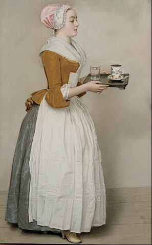
So the word “pastel“ comes from Italian “pastello“, that comes from Italian “pasta“. Nice, I love Bolognese. Hm, wait, it’s not about food here… Anyway, pastel is both a name for an art medium in the form of a stick and a drawing technique. It is used during the preparation phase for paintings, but some artists use it as a standalone art form. It is only possible with the usage of special fixative, since pastel material is very easy to destroy. One of the most prominent pastels is The Chocolate Girl:
But I digress. I will not go really deep into that. You better just read it in Wikipedia. What drives my attention to these type of themes is pastel colors. This is a palette of muted pale shades with high value and low saturation.

All these colors have one common characteristic: they are soft to the eye, calm, warm. They do not irritate our eyes and do not distract, letting your eyes relax. Seems like I am choosing these type of color theme subconsciously – it is just easy and pleasant to look at such interfaces for a long time.